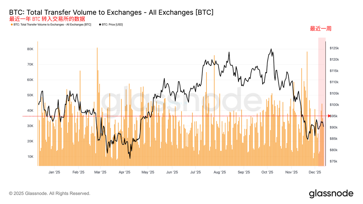
From a more detailed perspective on exchange flow data, if the amount of BTC flowing into exchanges is considered a reflection of investor panic, we can see that investor panic has been improving over the past three weeks, with weekly inflows to exchanges decreasing and remaining relatively stable.
Data on BTC inflows to exchanges over the past year
However, this stability is still somewhat different from the heightened FOMO emotions in July and September. As I have mentioned many times before, the increase that started in April was not due to a dramatic change in buying volume, but rather a significant decrease in selling volume, which can be clearly seen in this data.
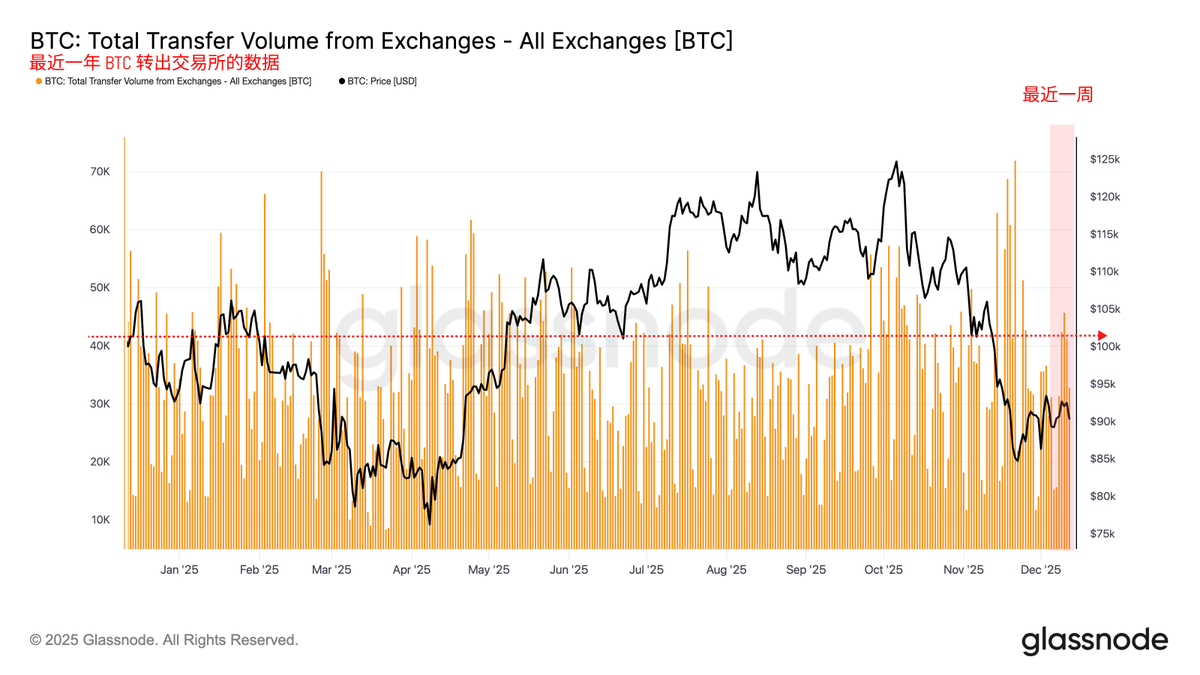
Data on BTC outflows from exchanges over the past year
If we consider the BTC transferred out of exchanges as a sign of optimistic sentiment, we can clearly see that when the amount of BTC flowing out of exchanges is high, it often corresponds to either a rising cycle or a price peak. Of course, the overlap of these two charts may not be very clear, so we can look at another chart.
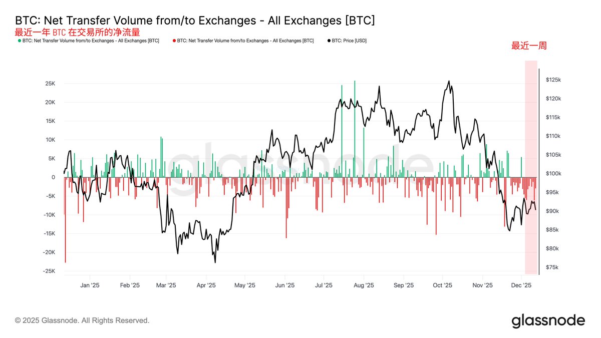
Net flow of BTC on exchanges over the past year
This chart shows the net flow data of exchanges over the past year, which simply means the result of inflows minus outflows. The green line on the horizontal axis indicates a positive balance for that day’s inflows and outflows, while the red line represents a negative balance. The former indicates net inflow, while the latter indicates net outflow.
In general, when the BTC flowing out of exchanges daily exceeds the inflows, it represents a stronger sentiment among investors to buy (bottom-fish), and we are currently in this state.
Bitget VIP, lower fees, better benefits


免责声明:本文章仅代表作者个人观点,不代表本平台的立场和观点。本文章仅供信息分享,不构成对任何人的任何投资建议。用户与作者之间的任何争议,与本平台无关。如网页中刊载的文章或图片涉及侵权,请提供相关的权利证明和身份证明发送邮件到support@aicoin.com,本平台相关工作人员将会进行核查。


