Original author: 47 Highway Store public account
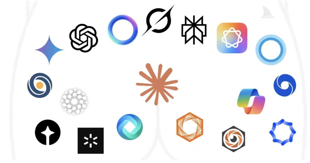
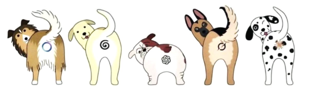
If you put together dozens of AI company logos, each valued in the billions, without any textual annotation, at that moment, you might experience a subtle illusion of being in the consultation room of a proctologist. There are no neural networks, no computational matrices, only a dense array of varying shapes that are struggling to contract, representing a group of backyards.
With Claude leading the way, blooming everywhere
If you take a closer look, you will find that these logos share a remarkably stable genetic structure: a hole in the middle, a circle outside, plus a bit of gradient, in the designer's prompter, it might be called data core, neural network, intelligent vortex, or information hub, but to the eyes of ordinary people, all they see is one thing: a very high-tech chrysanthemum.
And it's not just any chrysanthemum, but one that has a gradient color, slightly glowing edges, and is undergoing quantum computation—a future chrysanthemum.
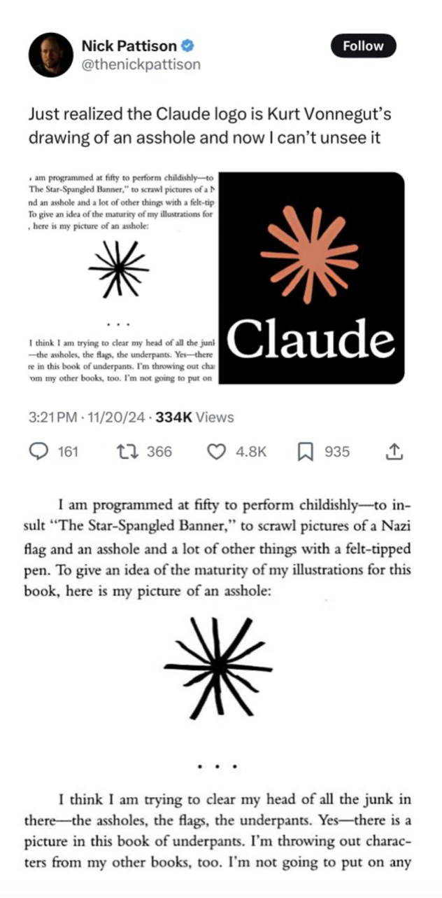
This person discovers the inspiration behind the Claude logo
Could be the skin eye illustrated in Vonnegut's book
Decades ago, literary giant Vonnegut casually drew this symbol in his work "Breakfast of Champions" with a felt-tip pen, noting beside it: this is an anus.
No metaphor, no sublimation, just the literal meaning.
He said that at fifty years old, he was still drawing these things to clear his mind. The profundity and correctness accumulated over fifty years needed an outlet to be released. The anus is the last uneducated organ in the human body; it does not perform the noble, does not pretend to be elegant, but directly returns what is swallowed back to the world.
Vonnegut drew the anus because he felt it was the only honest organ. Decades later, the same shape appeared at the press conference of a tech company, named the "core of the connection between humanity and intelligence."
No matter how grand the narrative behind this shape might be, the human retina always retains a remarkably cruel and irreversible “shape residency” mechanism.
The internet has a very stable law: once something is pointed out to resemble a certain organ, its fate is sealed.
Just like that building in Nanning which was observed by the whole internet due to an angle problem, at first it was merely a avant-garde city landmark; the designer may have wanted to express strength, future, or some sort of modernist sculpture. But once someone softly said it, from that moment, the brain completed the matching. When you look at that building again, you can no longer gaze at it directly. No matter how the designer explains that it is an energy field or information center, it no longer matters. In the eyes of bystanders, it's merely a giant physiological suggestion standing in the city center.
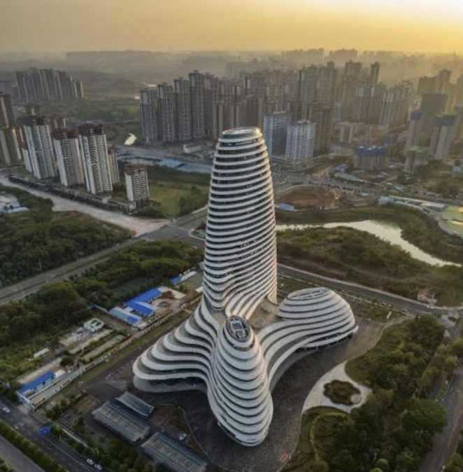
A new media center
And this visual curse has descended unchanged upon today's AI giants. But if you ask those designers who have been stressing in front of their screens, they will definitely feel wronged: this is truly not a physiological bad taste, but a certain inevitability of the universe's ultimate logic displayed visually.
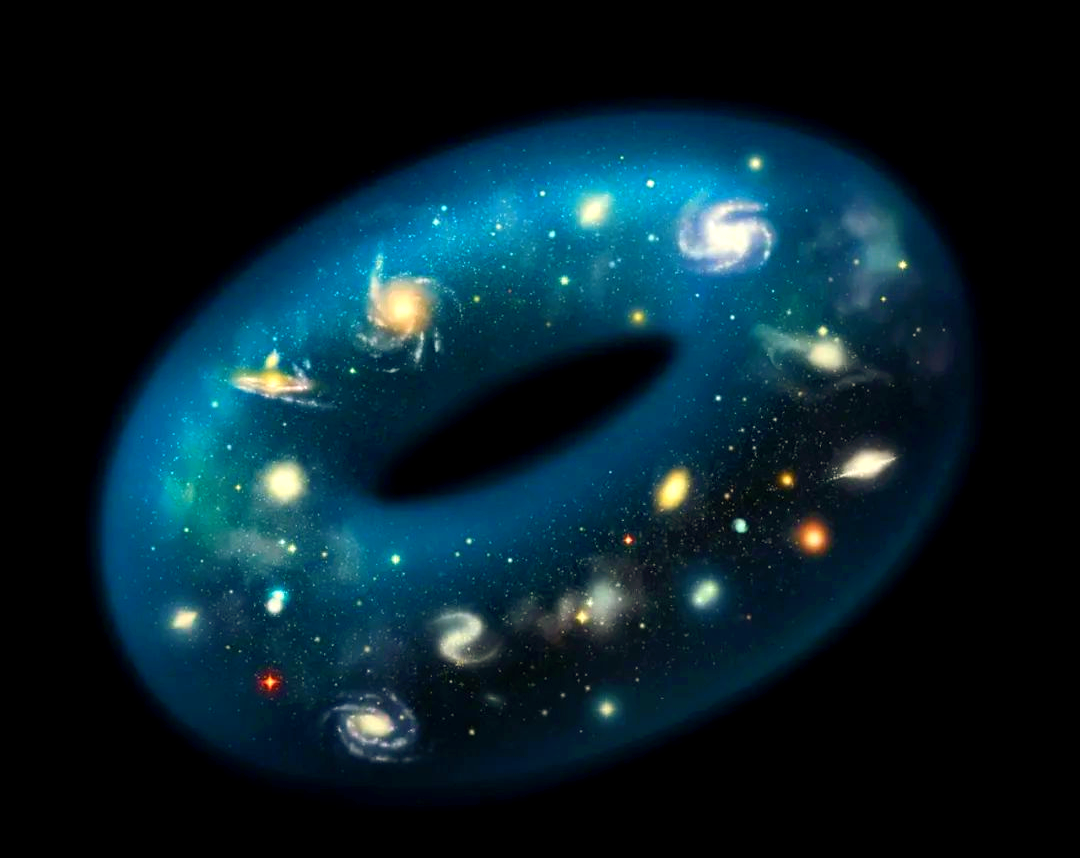
There is a famous joke in the mathematics community: to a topologist, a coffee cup and a donut are actually the same thing, and even humans and pants have no essential differences.
Topology does not care what an object looks like; it only cares about one thing: how many holes it has. As long as they can be transformed into each other through continuous deformation, they belong to the same structure in topology.

Adults in humans are messy in topology, having multiple holes
The handle of a coffee cup is one hole, and a donut has one hole in the middle, so in topological terms, they are the same shape. Thus, they share the same noble identity—a genus (Genus) of 1 toroidal structure. Following the same logic further, humans and pants do not seem to differ much, as the human body has a continuous digestive tract and two connected nostrils, while pants are conveniently also a two-hole structure.
From this perspective, the logos of AI companies being fixated on drawing a hole may just be an unintentional addition to an ancient mathematical tradition.
Silicon Valley designers spent half a day on their draft pages, realizing that to accommodate trillion-level data flows, the best container is not a closed sphere, but a ring with holes.
A hole signifies that the system is not closed; it can both consume everything and continuously produce everything, creating an unending circular passage. This was originally a tribute to mathematics. But as designers immersed themselves in this grand narrative, they evidently forgot where the most famous, self-consistent, and also possessing a genus of 1 toroidal structure in the human body is.
AI= Artificial Intelligence ✗
AI= Anal Intelligence ✓
Perhaps many years later, design history will seriously discuss this issue: why did the most advanced technological industry of the 21st century collectively choose such a highly unified visual language. They may conduct extensive academic discussions around this topic: "Circular structure and the visual symbols of artificial intelligence," "Topological metaphor in technology brands," "Visual expression of data cycles and open systems" ...
But the internet has actually provided a more direct explanation long ago: because it looks like an anus.

Stop struggling with what these logos represent for the future. Since AI is crazily consuming thousands of years of data from all humanity, then after being digested by a black box, ultimately excreting indistinguishable realities through this outlet, can also be considered logically self-consistent. When you find that you can no longer look directly at these logos, congratulations, you have not yet been completely tamed by the algorithms.
You still retain the most primal and precious spirit of human offense.
免责声明:本文章仅代表作者个人观点,不代表本平台的立场和观点。本文章仅供信息分享,不构成对任何人的任何投资建议。用户与作者之间的任何争议,与本平台无关。如网页中刊载的文章或图片涉及侵权,请提供相关的权利证明和身份证明发送邮件到support@aicoin.com,本平台相关工作人员将会进行核查。


