Original Title: Nothing Stops This Train w/ Lyn Alden | Bitcoin 2025
Original Source: Lyn Alden
Original Compilation: AIMan, Golden Finance
Current Status of the U.S. Fiscal Deficit: Nothing Stops This Train
In the past few years, I have popularized a phrase: "Nothing Stops This Train." Of course, this phrase originally comes from the TV series "Breaking Bad."

For those who haven't seen the show, it tells the story of a chemistry teacher diagnosed with cancer who turns to cooking meth to pay for his treatment and support his family. But of course, the moral trajectory of the story is that even after his cancer is cured, he ultimately cannot stop; he cannot stop what he is doing. By the fifth season, his colleague tells him, "We really need to slow down; we are going too far." He replies, "No, nothing stops this train."
I have been using this phrase to describe the current state of the U.S. fiscal deficit. In this rather concise presentation, I will delve into what this means, why it is important, and why it is so unstoppable. We are at a Bitcoin conference, but around us and across the world, there exists a much larger dollar system. Therefore, the interactions between the Bitcoin world and the dollar world are crucial for exchange rates, the economy, and overall investment.
Decoupling Phenomenon 1: Unemployment Rate Vs Federal Deficit as a Percentage of GDP
Now, as we begin, I will explain these rather concise slides. Some will be simple, and some will be a bit more complex, but I will guide you through the truly important parts.
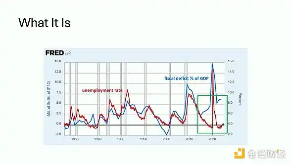
This chart shows two lines: one is the unemployment rate, and the other is the federal deficit as a percentage of GDP. This chart can be traced back several decades. As you can see from the slide, there has been a very good correlation between the two. During economic recessions, the unemployment rate rises, and the federal deficit also rises; during periods of economic recovery, the unemployment rate is low, and the federal deficit is low. A brief exception occurred in the 1960s, which you can see if you squint at the chart, during the Vietnam War, so there is a slight exception. But aside from that, the two lines are almost overlapping.
However, on the right side of the chart, I have circled in green, and since around 2017, we have seen a decoupling. Our unemployment rate is declining, and the unemployment level is very low, yet the deficit has surged to 6% or 7%. This situation was already occurring even before and after the pandemic. Clearly, during the pandemic, things became more severe, but we can now say we are in a new world.
I am not the first to talk about the deficit issue, but I am trying to draw attention to what is happening now that has not happened in the past few decades. We are entering a new era. This is the current state of the deficit.
Decoupling Phenomenon 2: Real Interest Rates Vs Gold Prices
But the second main question is, why is this important? Why are we discussing it at a Bitcoin conference? The short answer is that it is crucial for asset prices, especially for any scarce asset.
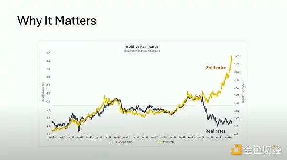
This chart shows that the golden line represents gold prices, while the black line represents real interest rates. Again, we see a very strong correlation between the two historically. For those who do not know what I mean by real interest rates, it specifically refers to the 10-year Treasury yield minus the CPI inflation rate.
The reason comparing gold and real Treasury yields is so valuable is that they are the two main reserve assets globally, competing with each other in scale. Gold is certainly quite scarce, with its supply estimated to grow by 1% to 2% each year, but holding it yields no return. If anything, you have to pay to store it. On the other hand, Treasury securities, you know, dollars and Treasuries, have a supply growth rate that is much faster, but you can earn a return by holding them.
During periods when yields are relatively high compared to the measured inflation level, some investors who might otherwise buy gold are attracted back to the dollar and Treasury system. But when yields are not high enough relative to inflation, many investors flock to gold. They basically say, "If I am not getting any return on Treasuries, why would I hold Treasuries that are much more abundant than gold?" Historically, there is a very strong correlation: high real interest rates mean (correcting the chart explanation) low real interest rates mean higher gold prices; in this chart, real interest rates are inverted, so the downward line indicates higher real interest rates.
Similarly, as you have seen in the past few years, especially since around 2022, gold prices and real interest rates have completely decoupled. So in this fiscally dominated environment, some new things are happening.
Of course, this is also important for our discussion of Bitcoin. If you had said five years ago that if interest rates were 4% or 5%, would Bitcoin still hold a large conference in Las Vegas with no empty seats? Would its price exceed $100,000 per coin? Most people would say no. In fact, many critics have long claimed that Bitcoin is just a zero-interest phenomenon, and once the Fed takes any hawkish measures, this bubble will burst. But what we have seen in the past few years is that the Fed has taken the most hawkish measures they could, even causing some banks to fail in the process, yet both gold and Bitcoin have continued to soar because something has changed.
Turning Point: Federal Debt Growth Continues to Outpace Private Sector
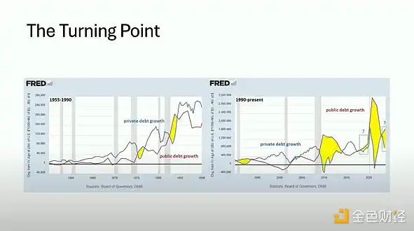
These charts are a bit cluttered, but I will guide you to focus on the important parts because this is where the real turning point is shown. The blue line in these charts represents the year-on-year growth of private sector debt, including bank loans and corporate bonds. The red line represents the growth of federal debt. So you have the private market and the public market. The left chart is from 1955 to 1990, and the right chart is from 1990 to now. This is a 70-year history.
If you look at the left side, for most of the time, the blue line, which is the growth of private sector debt, has outpaced the growth of public sector debt in any given year. A few exceptions occurred during recessions, which I have marked in yellow on the chart; these situations are quite rare. During recessions, deficits rise, bank loans decline, and then we move past that period. What you see on the right side of the chart is that since the 2008 global financial crisis, especially in recent years, we have been in a period where federal debt growth has consistently outpaced private sector debt growth. I have emphasized this again with those green boxes on the right, even in non-recession periods. This situation was already occurring before the pandemic and continues to happen now after all the money printing has settled.
The reason this turning point is so important is that when we examine the Fed's tools for controlling credit growth, primarily interest rates. If they want to slow down the economy, slow down credit growth, and try to curb inflation, they will raise interest rates to make borrowing less attractive. On the other hand, if they want to accelerate, they will lower interest rates.
The problem is that decades ago, when federal debt was low and most money creation came from the private sector, whenever they raised interest rates, they could slow down credit growth, and the slowdown in the private sector would outpace the expansion of the fiscal deficit. The problem now is that the federal debt as a percentage of GDP has exceeded 100%, which has only happened in recent years. When they raise interest rates, ironically, they increase the federal deficit faster than they slow down private sector credit growth. This basically means they no longer have brakes. Nothing stops this train because it no longer has brakes. Or in other words, the brakes are severely damaged. It feels as if we have passed through the looking glass and are now in Wonderland, where the rules that worked for most of the time are now working in reverse.
They basically have no way to slow down the total credit growth in the system, which is a new phenomenon.
Why the U.S. Fiscal Deficit is Unstoppable
Therefore, in the upcoming presentation, I will use a few slides to explain why the U.S. fiscal deficit is so unstoppable. Why can't just a few people come together to solve this problem? Why is it so deeply rooted? Why am I so confident in saying that nothing can stop this fiscal train, regardless of the election results? I said this before the election and I say it after the election because it really doesn't matter. Nothing can stop it.
1. Interest Expenses
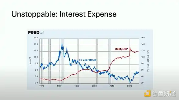
In this chart, we have a very simple graph. The blue line represents the 10-year Treasury yield, and the red line represents the federal debt to GDP ratio. You know, in the 1980s, debt levels were very low while interest rates were very high. We have gone through a journey of four to five decades where debt levels have risen, but this has been offset by structurally declining interest rates. This means, for example, if your debt doubles but your interest rate is halved, your interest expenses remain manageable.
So, throughout this entire 40-plus year period, interest expenses have actually been quite manageable. But eventually, we hit zero interest rates, and the laws of mathematics came back into play. So now we are in an environment where interest rates are no longer structurally declining for the first time in decades, while debt levels remain very, very high, the highest since the 1940s. Therefore, interest expenses are actually becoming an unprecedentedly significant part of federal spending. And there is no simple way to control it. If they lower interest rates too much, everyone will want to flock to scarce assets. But if they keep interest rates high, they will continually expand the federal deficit because, as I said, we now feel as if we are in Wonderland. This is a very large component.
2. Demographics and Social Security Fund
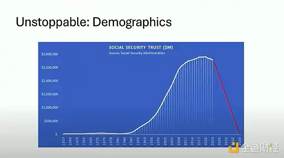
Another very large component is Social Security. This chart shows the Social Security Trust Fund. As you can see, it has grown from zero to about $3 trillion on the chart. The reason for this change over time is due to demographics. The baby boomer generation, an exceptionally large population born from the late 1940s to the 1960s, is a very large cohort that emerged after World War II. As they entered the labor market, they contributed to the Social Security system, which is why we saw a significant increase in the amount of funds being put in. Unfortunately, they did not invest the Social Security funds well; they essentially held it in U.S. Treasuries, which are not the best long-term investment.
According to the Social Security Administration's own data, by around 2035, they will exhaust that trust fund. This practically means they will spend that $3 trillion into the economy. This is happening as the baby boomer generation reaches retirement age, and they are already doing so and will continue to do so. This situation will persist. If you notice, it peaked in the late 2010s, around 2017-2018, and began a very early decline. It was at that time that the deficit decoupled from the unemployment rate, and federal debt growth began to outpace private sector credit growth. Many of these timing coincidences occurred because around the same time, interest rates stopped declining, and the baby boomer generation that funded all this growth is now entering withdrawal mode. So this money is being spent into the economy through healthcare, travel, housing—basically all aspects where people have to spend money. This is a background expenditure that will flow back into the system over the next decade.
Sometimes, that exact exhaustion date may be moved up or pushed back by a year, but it is primarily actuarial science and is basically inevitable. The important thing is that these people will vote. Young people may protest, but they will forget to vote. The older population really will vote. Now, anything that touches on the spending of this fund is a political hot button. Both major political parties in the U.S. have vowed not to touch Social Security during this time. So this is basically a done deal; even in a highly politicized environment, this is one of the few things that both parties fundamentally agree on.
3. Debt Ponzi Scheme
One of my last few slides is to emphasize the Ponzi scheme nature of this system. So even setting aside the current issues related to demographics and debt levels, fundamentally, the way this system is constructed—I mean the system referring to the central banking system and the fractional reserve banking system built on top of it, which we have operated for over a century in the entire fiat currency system—it relies on continuous growth. It is like a shark that must keep swimming or it will drown. Ironically, this is a system that must continuously grow.
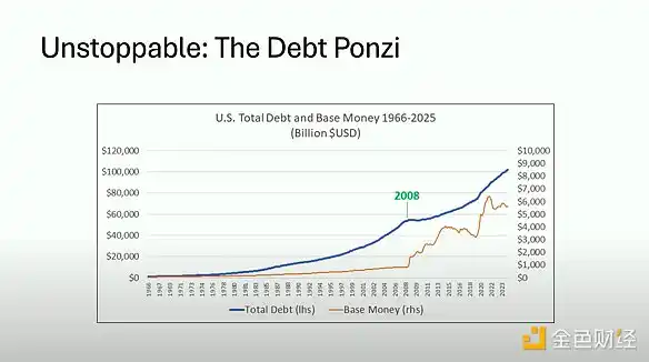
In this chart, the top line represents the total debt in the U.S. system, including public and private debt, which has actually exceeded $100 trillion for the first time. The bottom line is the monetary base. What we see is that throughout the entire period of this chart—I believe from 1966 to 2025—the total debt has never decreased, with only one very brief exception in 2008, when total debt in the system fell by about 1%. What they did was rapidly increase the monetary base from $1 trillion to about $6 trillion now. They are so intolerant of even minor deleveraging occurring that they let this party continue.
Specifically, at that time, if we do a little math, the total debt in the system in 2008 was about $50 trillion, roughly half of what it is now, while their monetary base was about $1 trillion. So the leverage in this system was 50 to 1. This is the kind of leverage you see in "Degen" derivative contracts in cryptocurrency. The leverage of the entire economy is 50 to 1. Specifically, they hit zero interest rates, so they could not continue to support the private sector debt bubble, and thus they turned to federal-level debt. This shows the sensitivity of the system. Over time, we are now more in a phase of public sector debt growth.
I actually looked at data even earlier than this chart, going back about 110 years, and there were only four other years when total debt nominally decreased, and that was during the Great Depression. So from 1930 to 1934 was the only other period of decline on the chart besides 2008. Therefore, in over 110 years of data, there are only 5 years where they tolerated the disintegration of this Ponzi scheme. This is the system we find ourselves operating within, governed by its mathematical laws. This is also the huge contrast it has with Bitcoin.
4. Long-Term Continuous 7% Deficit Growth
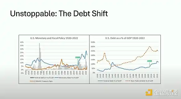
So for my last slide, we do not need to focus on the details, but just look at the shapes of these charts; these are charts spanning a century. The main point I make with these charts is that we have actually seen this story before. We have gone through something similar to what we are currently experiencing in the U.S., which was around the 1940s. The reason debt growth has been so smooth historically is that when they finally encountered something that truly challenged it, they would pivot the entire system, and we are experiencing a second instance of this.
Basically, you have a buildup of private debt bubbles, then you hit zero interest rates, so you cannot continue to leverage the accelerating private debt. What happens then is you find your leverage is 50 to 1, and you begin to disintegrate. How do you disintegrate a 50 to 1 leveraged system? The short answer is, you do not disintegrate. You simply print more units of currency; that is how they always handle it. So what happens is they turn to federal debt growth, they turn to running massive federal deficits. So even if private sector debt levels eventually flatten out for a time, it continues to grow in the public sector. This tends to be more inflationary and more persistent. Because when we reach the point I mentioned earlier, when the Fed raises interest rates trying to slow all this down, they expand the federal deficit faster than they slow down bank growth.
So basically, we are now completely decoupled. Note that anything I say has nothing to do with the Weimar Republic or hyperinflation. This is entirely about long-term, uninterrupted 7% deficit growth. We are not talking about a deficit that is 70% of GDP; we are talking about 7%, but it happens with clock-like precision every year. The important thing is its relentlessness.
Unstoppable U.S. Debt Vs Bitcoin
So as we look forward, this is the system in which Bitcoin will exist. If you summarize the entire presentation, all these charts, all these points, there are two main reasons why the U.S. fiscal deficit train is unstoppable.
The first is mathematics. It is the way they constructed this Ponzi scheme system that must continuously grow to avoid deleveraging in a crazy way. That is the system they built.
The second reason is human nature. None of us want to pay higher taxes. Those on the receiving end of the deficit never want to cut the deficit. Almost no politician has enough incentive to genuinely cut the deficit during their term. Basically, this represents a flexible ledger. This is the ledger we all use in the U.S. and globally. Because it is a flexible ledger, they can always create more units, and thus, this is the error correction mechanism they rely on time and again.
This stands in stark contrast to Bitcoin. You know, Bitcoin is in many ways the complete opposite of this system. It is a mirror of this system. It is not an ever-increasing supply that cannot even slow down; Bitcoin is absolute scarcity. It is not opaque; it is transparent. The error correction is not simply the ability to print more supply; the error correction that occurs in Bitcoin is that deleveraging can happen, but you can never shake the supply itself.
So basically, over the next decade, this train is unstoppable. The U.S. will run very large fiscal deficits, regardless of what else happens. Some things can greatly accelerate it, and some things may slow it down a bit, but nothing will have a meaningful impact. Therefore, one way to protect yourself from this situation is to own the highest quality scarce asset. Of course, the one we all love is Bitcoin.
免责声明:本文章仅代表作者个人观点,不代表本平台的立场和观点。本文章仅供信息分享,不构成对任何人的任何投资建议。用户与作者之间的任何争议,与本平台无关。如网页中刊载的文章或图片涉及侵权,请提供相关的权利证明和身份证明发送邮件到support@aicoin.com,本平台相关工作人员将会进行核查。


